Your program's look is set at Design & Content › Design in the admin. This article covers the settings every program needs. A Live Preview on the right of the page repaints as you type, with tabs for Home, Splash, Trivia, Desktop and Email, so you can see the effect before committing. Click Save Design Settings when you're happy.

Two colors drive the whole design, and they're the only two settings on the page that aren't an image or an optional override.
Primary Color — your main brand color. It paints buttons, selected answers, story backdrops, your member card, and the background gradient.
Highlight Color — the accent. Points pills, badges, links and anything that needs to stand out, plus the points-expiring email. Pick something that contrasts with Primary.
For more on how the colors are used, see our Colors article.
These are the four images fans see on mobile.
450×90 transparent PNG. Renders at the top of every screen. Keep the mark simple — it displays at about 225×45.

1242×2688 JPG or PNG, portrait. The main screen fans see when they first arrive, behind Log In and Join. Keep the bottom 674 pixels clear for the buttons, and be aware that small phones may crop the top.
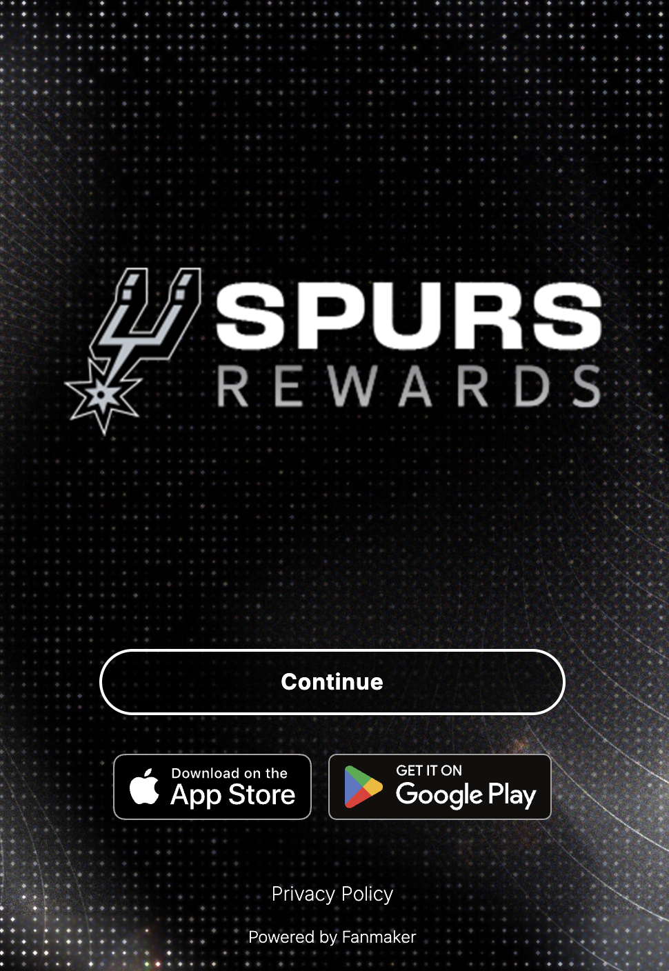
600×600 square, JPG or PNG. Shown above the login and registration fields.
What logged-out fans see on the desktop site.
2000×1600 JPG or PNG. Fills the browser behind every desktop screen — both the welcome page and the desktop app layout. It's center-weighted, so on a widescreen monitor the top and bottom crop first.
700×300 transparent PNG. Your program mark, centered over the welcome background.
640 pixels wide, between 100 and 1000 pixels tall, JPG or PNG. Displayed at the top of most emails your program sends.